Through this small guide we will get you kickstarted on your work with digital accessibility. The three examples of accessibility issues described in this post is an excellent place to start if you are in the early stage of ensuring the availability of your website.
Accessibility is about inclusion
love to see it – an increasing number of people and companies are taking the matter of digital accessiblity seriously. This is good for both business and for the around 20 percent of users who would otherwise be excluded from using the solutions. Digital accessibility is not about parallel solutions for certain groups of people, but to consider broad inclusion as a necessary building block.
At Sensus, we help our customers on a daily basis reach their goals within accessibility. We always do so based on international standards, our knowledge of inclusion technology and experience in making inaccessible solutions accessible.
Let us take a small dive into W3C – Web Content Accessibility Guidelines. These are a set of standards and guidelines many countries look to for creating legislation on the erea of digital inclusion. Both private and public sector actors are higly encouraged to take part.
We know that getting your webpage or applikation accessible can seem like a endless task. So here they are – the low-hanging fruits that will get you started.
Contrasts – text should be readable
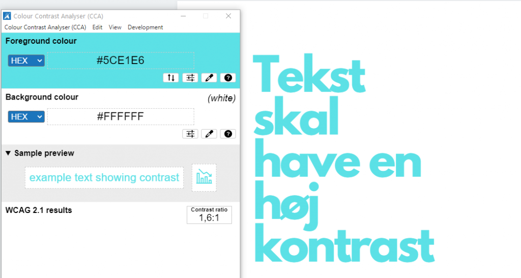
It makes sense. Text should be readable. For people with visual impairments or color blindness, however, this may be easier said than done. Therefore, a standard has been defined through WCAG 2.1, which defines a minimum requirement for contrasts between text and background colour, so as many users as possible can see text on a website.
The contrast requirement is conditioned by the size and styling of the text. (smaller than 18pt/24px, or smaller than 14p/18.5px and bold) needs a contrast ratio between text and background color on at least 4,5:1. For large text the requirement is at least 3:1.
For example, you could imagine a webpage styled in bright pastel colors. When a light blue text is used in conjunction with a white background, the textual content will be difficult for many users to perceive.
There are a wide range of browser extensions and other tools that can measure the contrast ratios for you. Download one and begin measuring elements on your webpage.

Alternative Text – visual information should reach everyone.
non-text-based content can contain important knowledge for all users. For users with visual impairment who, for example, use screen readers to navigate a webpage, it is especially important that informative graphics are described in an alternative way. We typically do this through so-called alternative texts.
In short, alternative texts are descriptive text that explains the meaning of a visual element. The alternative text is not visible to everyone, but something you usually create in HTML using the alt attribute (alt = ””). These tags allow screen readers to read aloud to the user.
For example, one could imagine a user with a screen reader on a website that offers food delivery. A graphic illustrates the three steps that the user must complete to get the food delivered. If this infographic is not described for visually impaired users, navigating through the webpage can be a frustrating experience. In the end, it can lead to the user completely abandoning the site.
It is important to assess the individual visual element. Does the element solely serve a decorative purpose? If so, the visuelt element should not have an alternative text. If not, it should be have a short descriptive alternative text.

Keyboard navigation – not all users can use a mouse or a touchpad
Some users do not use a mouse or a touchpad when navigating a website. This is often the case for users with motor disabilities who are unable to perform the fine motor functions required of a mouse or touchpad.
Part of the requirements for keyboard navigation is that all components (content with functionality) must be able to be operated through a keyboard.
An example we often see is swipe components that do not allow keyboard users to activate the functionality. For example, it could be on a website where the user confirms a food order using a swipe component. If users who use the keyboard when navigating a website are unable to activate the component using the keyboard, they will be excluded from using the site.
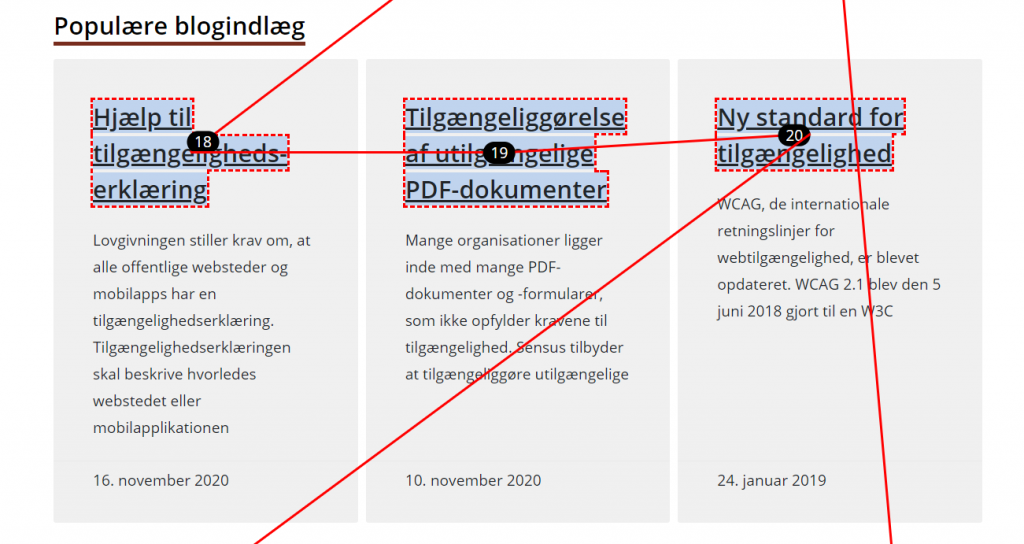
You can begin testing the accessibility and possibilities of keyboard navigation on your website by using the tab button and the arrow keys while tabbing thorugh a website’s content.

So, what is important to consider moving forward?
- Are there high contrasts between text and background color on my website?
- Do screenreader users get enough information about visual content on my website?
- Are there decorative elements that screenreader users do not need to have read aloud?
- Can I use my keyboard to access all clickable content on my website?
